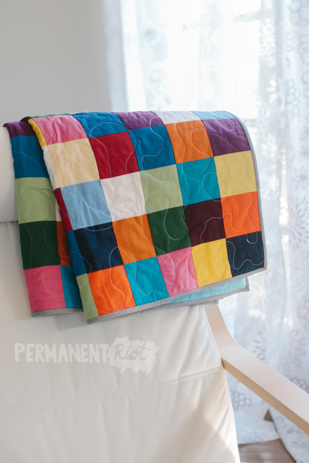
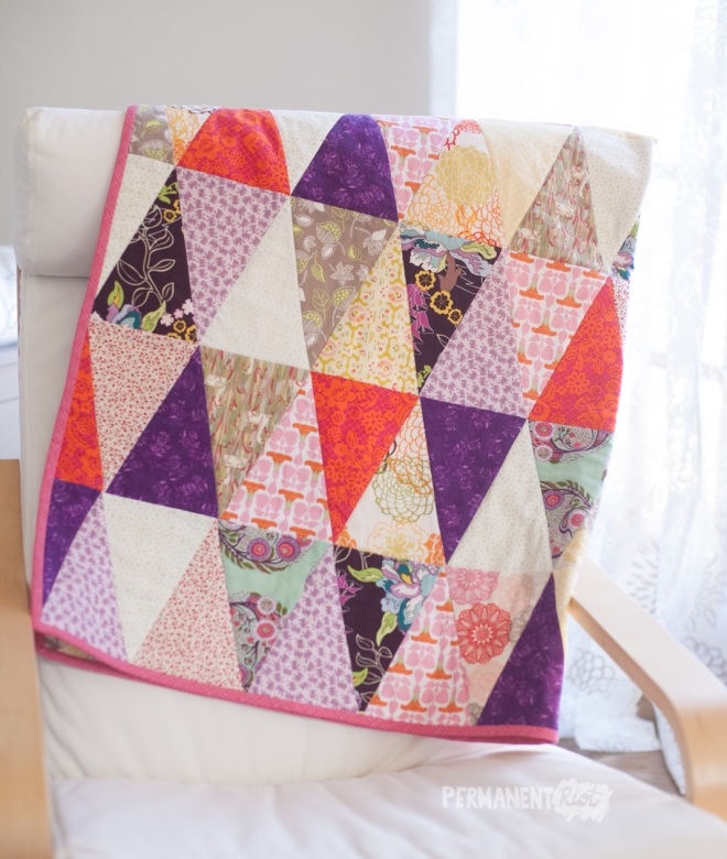
My patchwork scrap quilt is finished! This is the most time intensive quilt I’ve made to date (so many squares!) and includes scraps from the past eight years of sewing. It was a serious labor of love, and I considered chucking the whole thing out the window three or four times before it was finished.
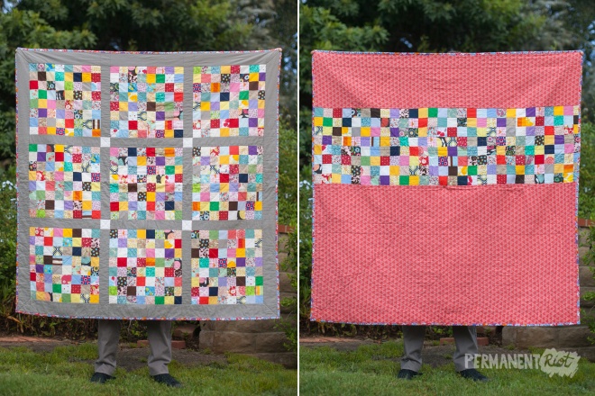
I didn’t want to use strip piecing because I was hoping for a more random arrangement of squares, so each square was individually cut and painstakingly arranged (I always overthink that part!) I sewed the front blocks together using interfacing, which I had read was a shortcut for piecing small squares. It ended up being a major pain and if I were to redo the quilt I think I’d skip it the next time around. The back piecing was done without interfacing and I feel like it went more quickly while still being just as accurate.

The fabrics I used are not only quilting scraps but scraps from dresses I made for my girls as toddlers and the overalls I made for my son’s first Easter. There are scraps from bags and baby blankets and Christmas gifts… when I look at this quilt I am flooded with memories of all of the things I’ve made, which is a pretty great feeling. I also got the added bonus of majorly cleaning out my fabric cabinet. I cut all of the remaining scraps down into manageable and regularly shaped pieces and folded them neatly, and tossed all the tiny pieces. It’s nice to finally feel like I’m not drowning in fabric (for the moment).
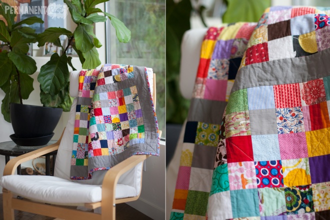
The quilt is backed in a super soft double gauze cloud 9 cotton with a strip of pieced squares down the middle. I love how soft it is, but it did wrinkle a little bit underneath while I was quilting it together so it’s a little wonky. As is everything I make. I think the softness makes up for the imperfections. It’s bound in a crazy patterned bias binding that I made… I figured the total lack of cohesion in the fabric patterns called for something extra outrageous as binding.
Hooray for finished quilts, hooray for using up years worth of scraps! It’s my new favorite blanket.


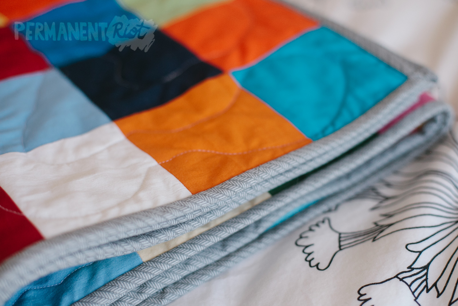


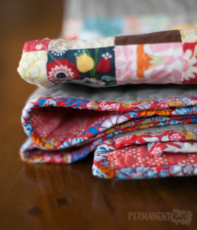
 The back of the quilt has a row of strips from the leftover fabric from the front, just because I can’t stand to leave the back of a quilt plain (even if it would be a time saver and I could always use a time saver).
  The majority of the fabrics (the prettiest ones for sure!) came from my friend Jean (thanks Jean!) who was trying to get rid of some fabric that no longer sparked joy for her (thank you to Marie Kondo too!) and I am so glad that she gave them to me because they were definitely the inspiration for the color palette that I chose for the remaining fabrics.
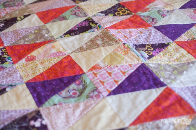 My favorites are the bright reds and deep purples, I love how they pop out when you see the whole thing together.
 I finished this quilt with some hand sewn bias binding and a painted label. I still just don’t seem to have the patience or talent for nice hand embroidery so I prefer the look of a painted label for now.
 Hooray for finishing another quilt! I was hoping to have this one done by Christmas but was able to hand it over completed on the 26th. Not too bad for a hectic holiday season. I also finished one other quilt, the one I had been working on for ages for big brother Raylan, so I will be sharing that one next. Now if I could only finish up that baby clothes quilt for Edith…
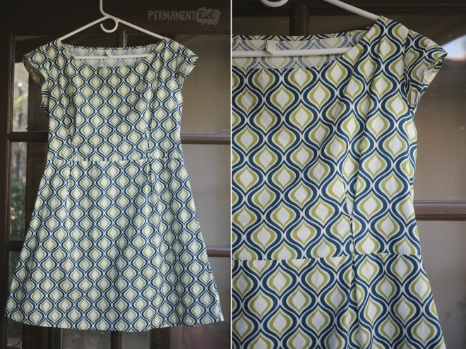
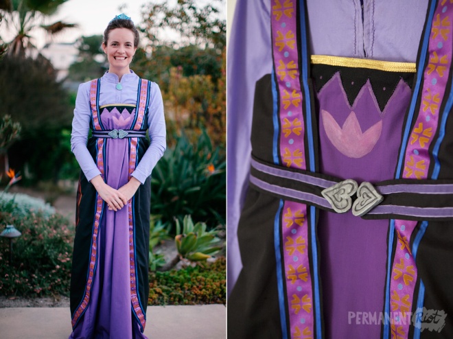
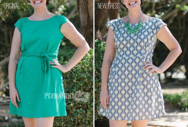 The original dress was so comfortable and so easy to wear – looks like real clothing but feels like pajamas is my gold standard – so I couldn’t resist making one that fit exactly the same. I just pulled some cotton out of my fabric closet (hoarder stash?) to make this. It’s a quilting cotton so it obviously doesn’t have the exact same drape as the original, but it works for me.
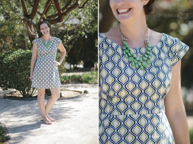 Since I never zipped or unzipped my original dress (it had a hidden side zip) I decided to leave it off, and I thought that the tie sash might be a little much with the busy fabric pattern so I left that off as well. It was such a quick and easy project – just a simple trace and cut and an afternoon’s worth of sewing. It’s the kind of project that makes me wonder why I don’t make more things for myself… especially when I can have a new version of my most comfortable and long since out-of stores dress in just a single afternoon without even leaving the house. I think I need to make more of these…